Sunday, March 15, 2015
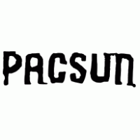
Pacsun is one of my favorite clothing stores. However, this does not mean that their logo is as good looking as some of their clothes. Something that is very popular right now is the destructed font. Fonts that look edgy and broken. The font used for the Pacsun logo is the perfect example of this. I like the font just fine and it definitely represents the company and their edgy fashions. The logo looks fine by itself but unfortunately the designers decided to put the logo inside an oval. A lot of there marketing focuses on a young group of people and the advertising usually gives a representation of freedom and youth, so why would they trap their logo inside a stroked circle if this was the image that their marketing team was trying to convey? The font doesn't need to seem trapped and perhaps the designers wanted the lines to represent a wave or a surf board. It would make a lot of sense and look better if the circle was in the shape of a surf board. Changing the grey to a different color might also make the design better.


Subscribe to:
Post Comments (Atom)

No comments:
Post a Comment